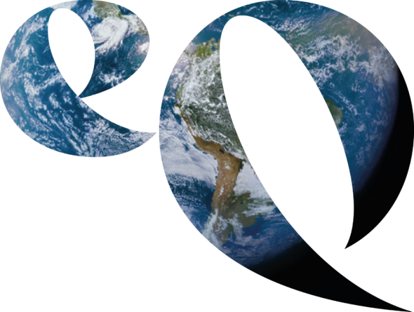
EQ has had a logo ‘makeover’. It retains the geometry of Phi, the golden section proportion that carries so much information and philosophy central to EQ, but also incorporates the tilt of Earth’s axis – 23.5°
The Golden Section
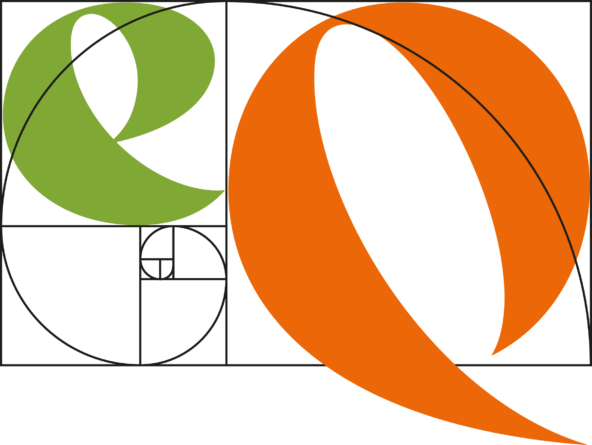 The two letters are contained within the rectangle which is built from the ratio 1:1.618, aka Greek letter Phi, or the Golden Mean/Golden Section. It has been known of since early history, and lies behind and within famous buildings and images in all cultures. Think Pyramids, Mona Lisa, Beijing’s Imperial City… it’s a very long list.
Nature’s building block
More importantly, Phi is also related to the Fibonacci series and is a key mathematical building block for patterns in the natural world. Think sunflower seeds, nautilus shells… it’s an even longer list.
The axial tilt
The new logo also incorporated the polar axial tilt – 23.5° from the perpendicular to the Ecliptic – that gives us our seasons, and makes the equinoxes, as balance points between the seasons, such significant events across the planet. EQ’s new promo movie explains all this as I draw the logo on Brean Beach, Somerset.
Make your own logo
You may come across the original EQ logo on this site. It is less attractive, but also Phi-based, so it can be simply made using Euclidian geometry: all you need are compasses, protractor and straight edge. This logo is a registered trade mark®. Martin built this logo on the beach at Lendalfoot South Ayrshire as the second part of an al fresco lecture: Adventures in Space and Time ![]()
EQ and CO
Once Martin’s recreational cycling network around London was renamed Cycle Orbital, it became clear the two logos – CO and EQ – could and should be linked. To illustrate, he used a bike wheel and pump, and drew the CO logo with a bit of driftwood in the sand on the same South Ayrshire beach, one-handed, filming it with the other. Not perfect, but not a lot of people can do that!
Cycle Orbital’s logo was designed by Christine Ayre (c@christineayre.com) for the launch of its site in 2021. She and I then turned our attention to EQ. We think the new dynamic brand image will work in all sorts of contexts. It’s also so positive, so inviting, don’t you think?